Assisting a network of Black activists in its rebirth
Kinfolk Network contacted us after a year of deep organisational work, ready to step back into the world and shine.
Organisation: Kinfolk Network
Credits: Debs Durojaiye, Juliette Mothe, Riwan Rejon
Services: Content work, UI/UX, Visual Design, Development
Deliverables: Content recommendations, Visual identity, Social media banners, Website

CHALLENGE
Only weeks away from Kinfolk’s summer program, we had to move efficiently to help design and restructure content, and match it with a playfully radical brand-new visual identity.
Aligning their voice, identity and ambition with a quick intervention
Opportunity
As Kinfolk Network was getting formally reintroduced to the world, we set up this new iteration of the brand for success by rooting their identity in the joyful solidarity of the convenings they held in the past.
Going back to their roots to help them grow


Strategy
What’s in a name?
Although being officially named Kinfolk Network, the initiative was often informally shortening its name to KIN. This moniker had made its way to their previous logo, making it difficult to set them apart from the various companies and initiatives sporting the same name. We suggested using their full name to increase memorability.
Boosting visibility, gearing up for impact
Structuring content
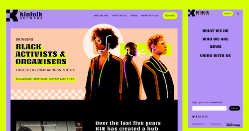
Content is often neglected or underdeveloped when commissioning design work, mostly because of an internal skill gap and a lack of visibility on how content needs to be crafted for the web and other mediums. We helped create a clear information hierarchy and concise sections to help users parse content quickly.
Developing their visual identity
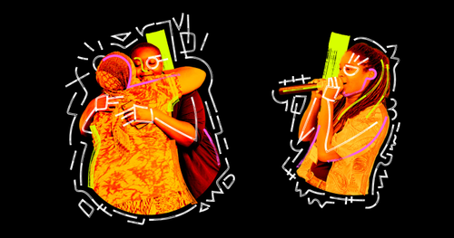
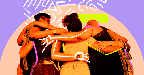
We powered through stages of visual explorations to help give a clear direction to their brand-new identity. The result is a bright, modern Basquiat-esque look and feel centring support and community.

Reach out and say hello
If you want to collaborate with us on a project we’d love to hear from you. Email us at hi@multitudes.coop

