Exploring Law Centres Network’s relationship with radicalness
LCN reached back after a first successful collaboration to consult us on a complete website and messaging overhaul. After a few internal attempts to determine an unapologetic creative direction for the brand and organisation website, a general dissatisfaction lingered among team members: the new mockups fell a little short.
Organisation: Law Centres Network
Credits: Debs Durojaiye, Juliette Mothe
Services: Brand audit, design facilitation, brand design, UI/UX, visual design

Challenge
We started by asking questions: What had led to those mockups? What did and didn’t work for them? What was the design rationale behind their current visual choices? Would adding more ‘oomph’ fix the problem? It was difficult for them to pinpoint. We decided to investigate and recommended a brand discovery workshop.
Bridging the gap between ethos and output
Opportunity
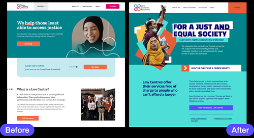
We could sense a gap between what the team felt they needed and what they currently had. Our design workshop allowed us to zero in on the reasons for this disconnect. And after reading through LCN’s documentation and interacting with the team, it all made sense: LCN’s fierce values of solidarity, community and care were directly at odds with the rather timid look of their latest iteration.
Connecting the dots


Strategy
Unearthing tensions and necessary compromises
Although building a brand involves telling a story, we believe it should be true to what an organisation is and wants to be: an honest reflection of where you are and a commitment to where you go. This approach is tough as it forces us to look our imperfect strategies in the eye. In practice, overt radicalness can be unsafe, making you a target, endangering funding or alienating your organisation from moderate supporters or stakeholders. It’s a tough exercise that LCN team members embraced as we worked toward a sustainable identity that matched the realities of their work.
Matching team ethos with the right external language
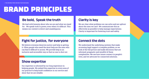
Developing brand principles
We developed brand principles with the team to guide their creative decisions moving forward. We centred the most important aspects: how the team provides support and the impact they make in the lives of their service users and members. These principles extend beyond branding and are valuable for guiding team decisions in other areas of service delivery. They are rooted in legal justice, fairness and equality for all.
Designing within the network’s constraints
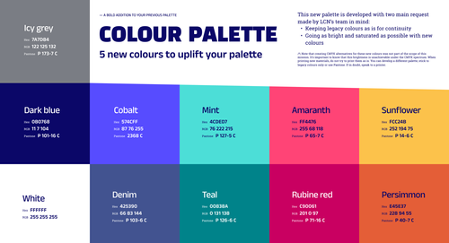
With a strong national network of 30+ law centres and countless digital and physical assets, this brand evolution had some internal constraints. LCN chose to keep part of its visual identity foundations (logo, colours) to limit the risk of inconsistencies between members.
Templating and documenting
We focused on ease of use and clarity of intentions to support the team and future contributors in building on top of what we laid out during this mission. In our new brand guidelines, we kept records of what our collaboration unearthed, what issues it solved, what issues it created and what we couldn’t tackle here.
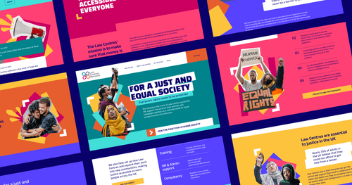
On the digital front, we broke our new mockups into a library of components, effectively showcasing the system this new language uses.
Deliverables
- Brand principles
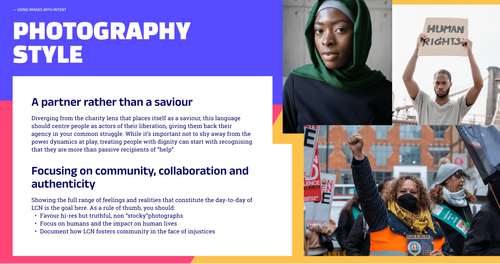
- New colour palette, fonts, and visual elements
- Brand use guidelines
- Responsive website mockups and component library

Reach out and say hello
If you want to collaborate with us on a project we’d love to hear from you. Email us at hi@multitudes.coop

